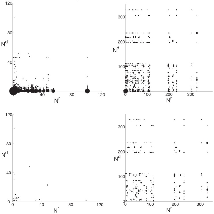
Figure 1. Revert and mutual revert maps of Benjamin Franklin (left) and Israel and the apartheid analogy (right).
Diagrams in upper row show the map of all reverts, whereas only mutual reverts are depicted on the diagrams in the lower row.  and
and  are the number of edits made by the reverting and reverted editors respectively. Size of the dots is proportional to the number of reverts by the same reverting and reverted pair of editors.

