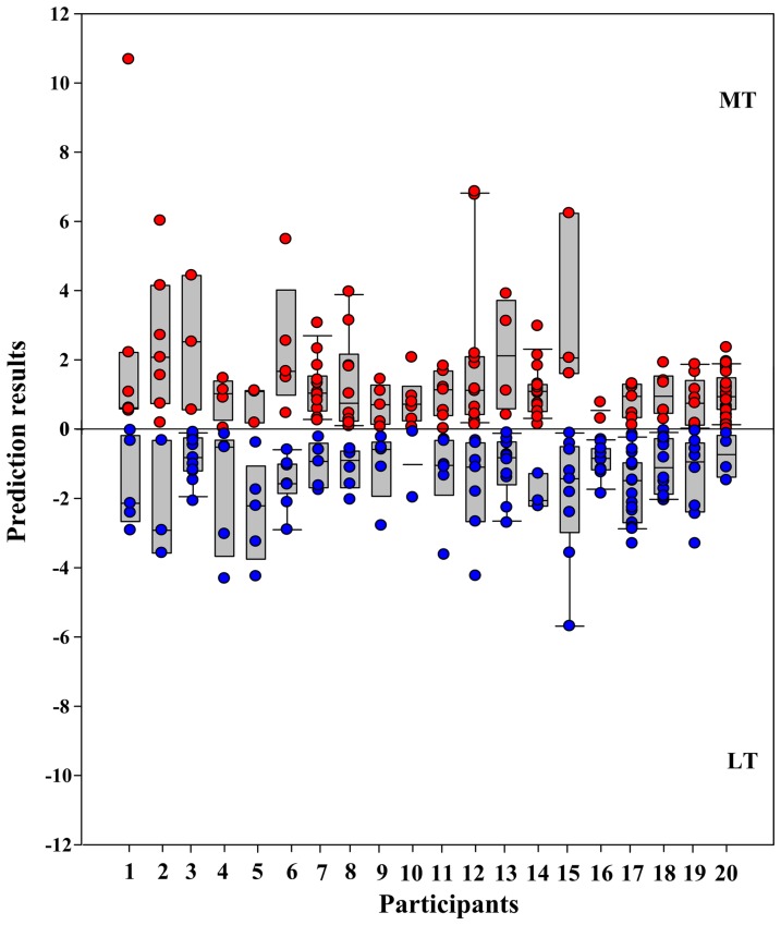
Figure 4. Classification results for each patient.
The x axis represents individual patients and the y axis represents the prediction results. The more negative (lower part, blue dots) or positive (upper part, red dots) the value on the y axis is, the better the classification performance is, for each individual patient. Each bar indicates the mean value and the 5% and 95% confidence interval of the correctly predicted results. Each dot indicates a single prediction during leave-one-out cross-validation.

