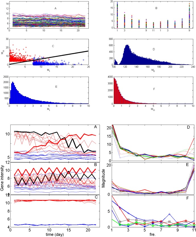
Figure 3. I Microarray data of 31,000 genes.
IA. Gene intensity vs. time. Only 200 genes are shown. IB. Magnitude of all genes vs. frequency. It is clear to see that there are two main frequencies in the data, i.e. the one of one day period (M11, the 11th column) and the other of 22 days period (M1, the first column). The DC term M0 is not shown. IC. Two dimensional plot of M11 vs. M1. ID. The histogram of the DC term. There are two peaks in the histogram. IE. The histogram of M1, it is a Weibull distribution. IF. The histogram of M11, it is an exponential distribution. II. Time trace of top ten genes with 22-day, one day period and flat. IIA. Time trace of the first (in red and black) and bottom (in blue) ten genes with the strongest amplitude of the period of 22 days. There are two classes: one is up regulated (red thick line), the other is down regulated (black thick lines). IIB. Time trace of the first (in red and black) and bottom (in blue) ten genes with the strongest amplitude of period of 1 day. There are two classes: one is on-phase (red thick line), the other is off-phase (black thick line). IIC. Time trace of the first top (in red) and bottom (in blue) ten genes without rhythms. IID, IIE, IIF, the power corresponding to IIA, IIB and IIC respectively.

