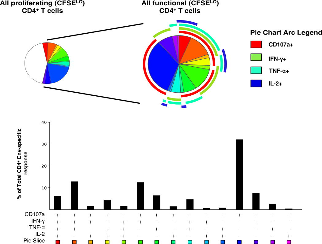
Figure 4.
Polyfunctional analysis of proliferating HIV-1 Env specific CD4+ T cells. The pie chart on the left shows the functional profile of all proliferating CD4+ T cells (CFSELO), while that on the right shows only those proliferating CD4+ T cells that are functional after re-stimulation with peptide-pulsed autologous B-LCL. Pie slices correspond to the fraction of cells within the CD4+ T cell population while the pie arcs show the relative amount of each individual function. The bar graph represents Boolean subset analysis of all functionally distinct cells within the total CD4+ population. The x-axis shows all possible combinations of responses, while the y-axis represents the median percentage of each subset within the functionally positive CD4+ population. Results shown are generated from 17 vaccinees with positive proliferative responses by CFSE analysis.

