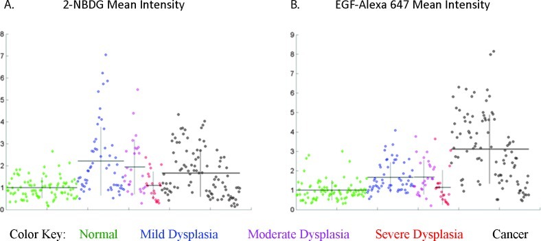
Figure 5.
Scatterplots showing the distribution of feature values within the set of 286 regions; each point represents a single region. Regions are grouped by pathologic diagnosis with green indicating normal epithelium, blue indicating mild dysplasia, pink indicating moderate dysplasia, red indicating severe dysplasia, and black indicating cancer. Horizontal black lines indicate the mean feature value and vertical black lines indicate ±1 standard deviation for each pathologic category. The scatterplots show the following features: (A) mean intensity of the 2-NBDG signal and (B) mean intensity of the EGF-Alexa 647 signal.

