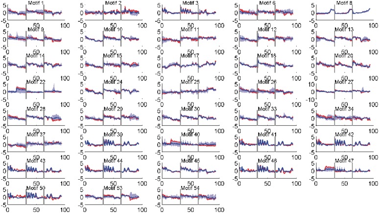
Figure 1.
Activity profiles of selected motifs (those having > 50% correlation with their targets). Shown in red is the (mean) predicted activity of the motif using the factor model while in blue is the average expression profile of the (at most) top five significant targets. The shaded area (light blue) shows the range of the gene profiles of these top significant targets. Vertical lines (grey) separate the three time series, TS1, TS3 and TS5 respectively. Activity profiles of all motifs are given in Supplementary Data (Supplementary Figures S14 and S15).

