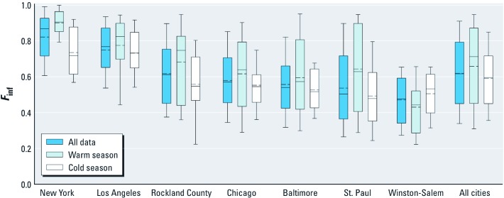
Figure 1.
Distributions of 2-week average Finf by community and season. Communities are shown in order of decreasing median Finf. Solid lines in boxes represent median values; dashed lines in boxes represent mean values; boxes represent 25th and 75th percentiles; whiskers represent 10th and 90th percentiles; outliers are not shown. The number of observations and homes for each community/season is given in Table 1.

