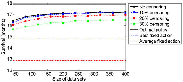
Fig 1.
The solid black curve, dashed blue curve, dot-dashed red curve, and dotted green curve correspond to the expected survival time (in months) for different data set sizes with no censoring, 10% censoring, 20% censoring, and 30% censoring, respectively. The expected survival time was computed as the mean of 400 repetitions of the simulation. The black straight line, blue dashed straight line, and the dot-dashed red straight line correspond to the expected survival times of the optimal policy, the best fixed treatment policy, and the average of the fixed treatment policies, respectively.

