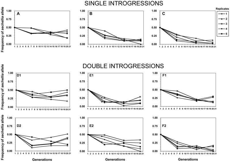
Figure 2. Frequencies of the nine sechellia markers in the six competition experiments over 20 generations.
X-axis: generations. Y-axis: frequencies of sechellia markers. Each plot monitors the frequency of a single sechellia introgression relative to its simulans counterpart. A–C plots represent experiments with only a single introgression per genotype, while D1–F2 plots represent experiments with two sechellia introgressions per genotype, even though each plot follows only a single introgression/marker. Five experimental replicates for each marker. See Figure S1 for introgression details.

