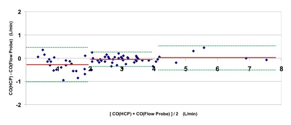
Figure 2.
Bland-Altman plot of the collective results of all six animals. For each moment in time during the experiments that a cardiac output value was produced by the HCP system, the difference between the CO, according to the HCP, and the CO, according to the flow probe, was plotted as a function of the average of both CO's at that moment. For each of three intervals along the x-axis (region 1: CO < 2 L/minute; region 2: CO between 2 and 4 L/minute; region 3: CO > 4 L/minute), the bias is rendered (red solid line), along with the limits of agreement (green dotted lines).

