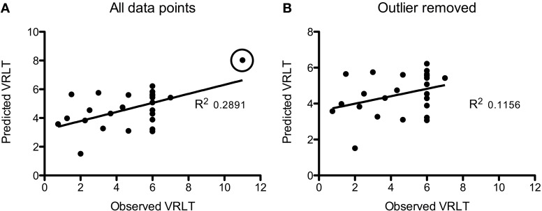
Figure 5.
Plots of the Support Vector Regression (predicted versus observed VRLT score). (A) Shows the full cohort: note that one data point (circled) appeared to be a potential outlier. Removing this data point (B) diminished the strength of the correlation though it remained significant (p = 0.05).

