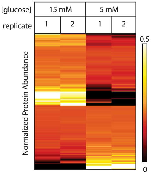
Figure 4.
Clustering analysis of proteins with differential abundance shows reproducibility. Heat map representation of the data shows relative levels of differentially abundant proteins on each row with the cell color representing relative protein abundance [black (low abundance) to red to yellow to white (increasingly higher abundance)].

