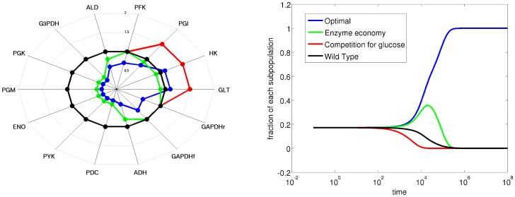
Figure 8. The competition experiment, to illustrate the optimal enzyme distribution considering the trade-off between enzyme economy and competitive ability for extracellular glucose.
The radar plot on the left represents the enzyme levels, relative to wild-type, and the plot on the left represents the competition of each subpopulation with a specific enzyme setting as described in the radar plot. The color for each subpopulation is the same in both plots and is described in the legend.

