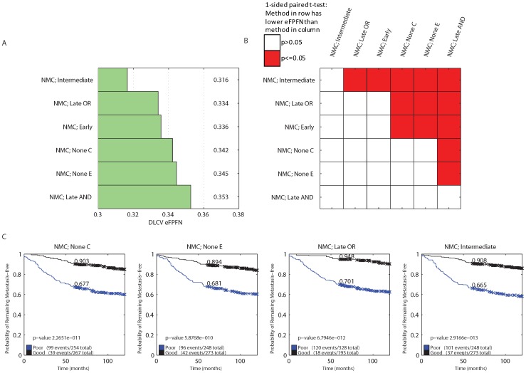
Figure 9. Error rate and KM curves for the NMC classifier with all integration strategies applied to four independent dataset.
A) Bar plot indicating the average DLCV eFPFN errors obtained using the NMC classifier with different integration strategies, and types of input data. These results were obtained using the 521 cases from the four independent datasets. B) Overview of all pairwise comparisons of the NMC classifiers, by means of a one sided, paired t-test, testing the hypothesis that the error associated with the approach listed in the row is lower than the error associated with the approach listed in the column. Red cell shading indicates a p-value smaller than  , and white cell shading indicates that the p-value was larger than
  . C) Kaplan-Meier curves of the NMC classifier without integration, and the intermediate and late OR integration strategy. We’ve indicated the p-value from the logrank test, and the fraction at five years.

