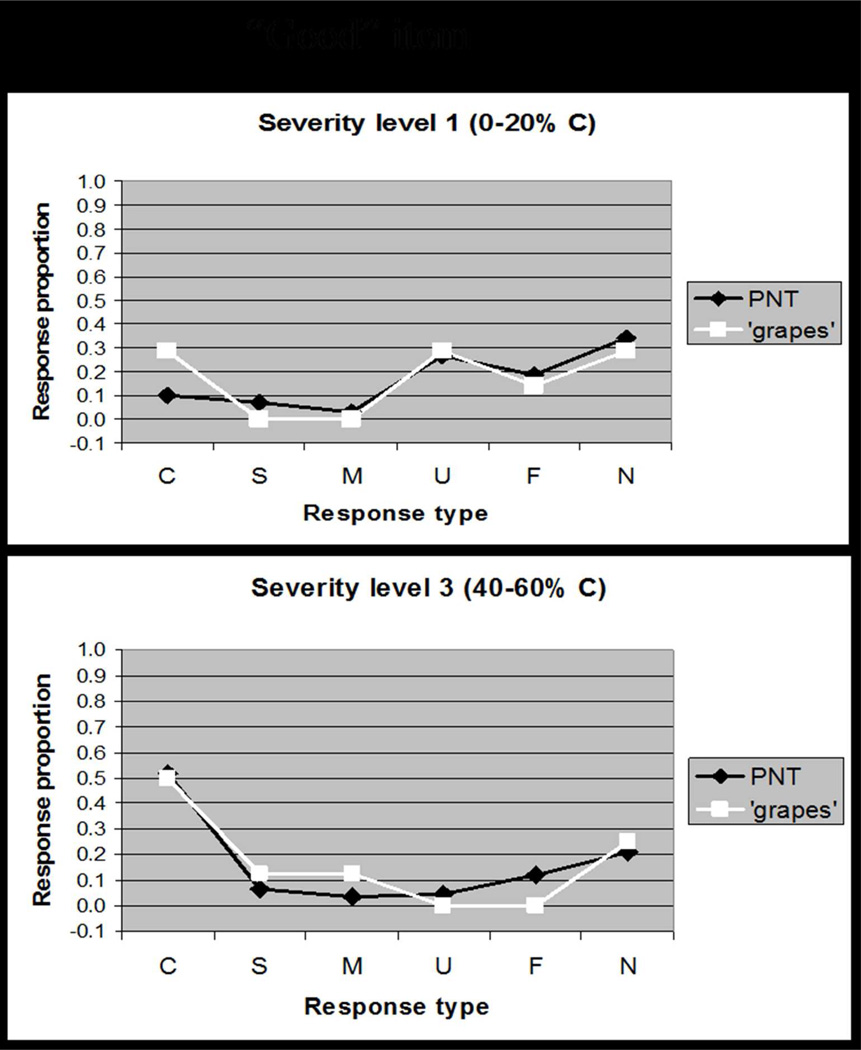
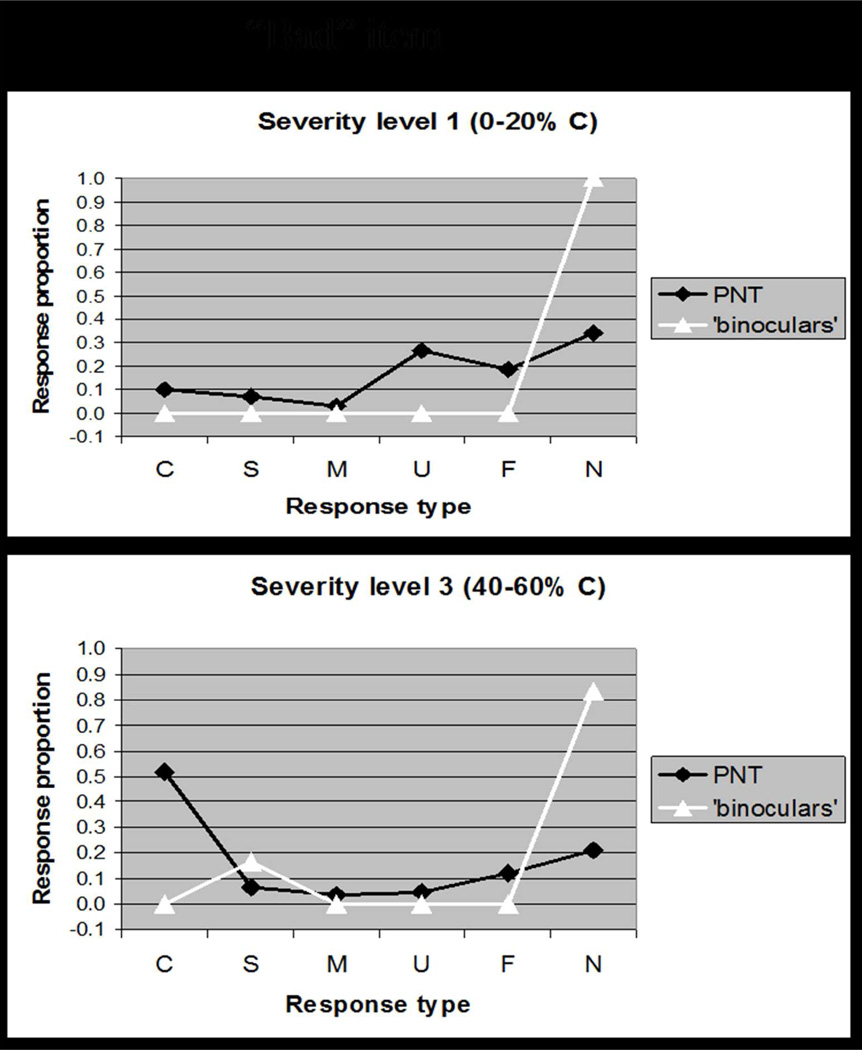
Figure 2.
Based on data reported in Schwartz et al. (2006), these plots comparing the distribution of response types (Correct, Semantic, Mixed, Unrelated, Formal, Neologism) for a single item to the distribution of response types on the full PNT. Figure 2A shows how a "good" item, GRAPES, elicits responses that are typical of patients at different levels of severity. By contrast, Figure 2B shows how a "bad" item, BINOCULARS, elicits responses that deviate from the typical response pattern. Our Item Response Analysis procedure quantified the discrepancy in response distributions to rank items for selection (see Appendix 1).


