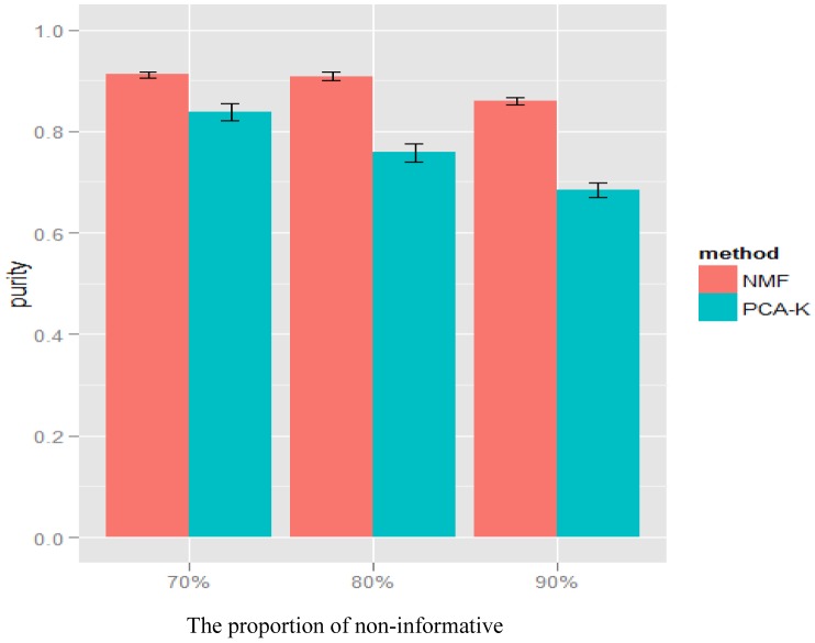
Figure 3. Simulation results of NMF and PCA-K for various proportions of non-informative genes  .
.
The simulations for a range of proportions of non-informative genes ( ) under MAF difference
  and magnitude of SNP effect
  . The x-axis represents the proportions of non-informative genes. The y-axis represents the average purity given by NMF (red) and PCA-K (blue). The average purity of each method was shown as mean
 standard error.

