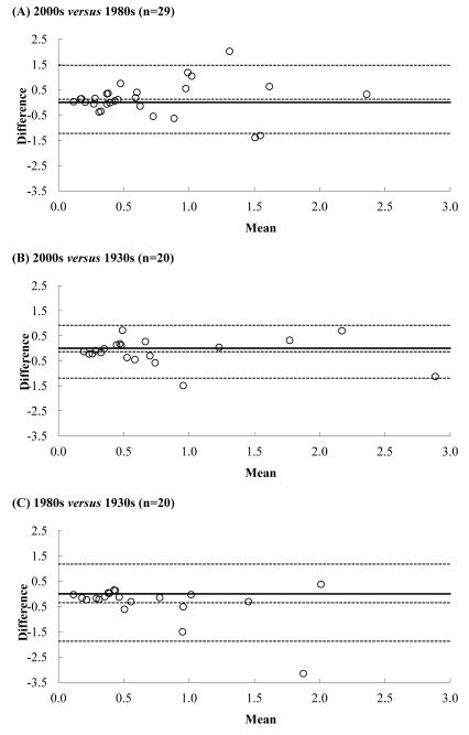
Figure 1.
Comparison of the iron content (mg iron/100g food) of the same fruits between different decades: the analysis presented here (2000s), the latest published values (1980s) (1) and the earliest published values (1930s) (13). Comparisons were made using the Bland-Altman method (14). Briefly, for each food, the difference in the iron content between the two decades being compared (decade 1 - decade 2) is plotted against the mean iron content of those two decades. The mean and 2SD of the differences were calculated and are represented in each graph by the dotted lines. The continuous line represents the null difference.

