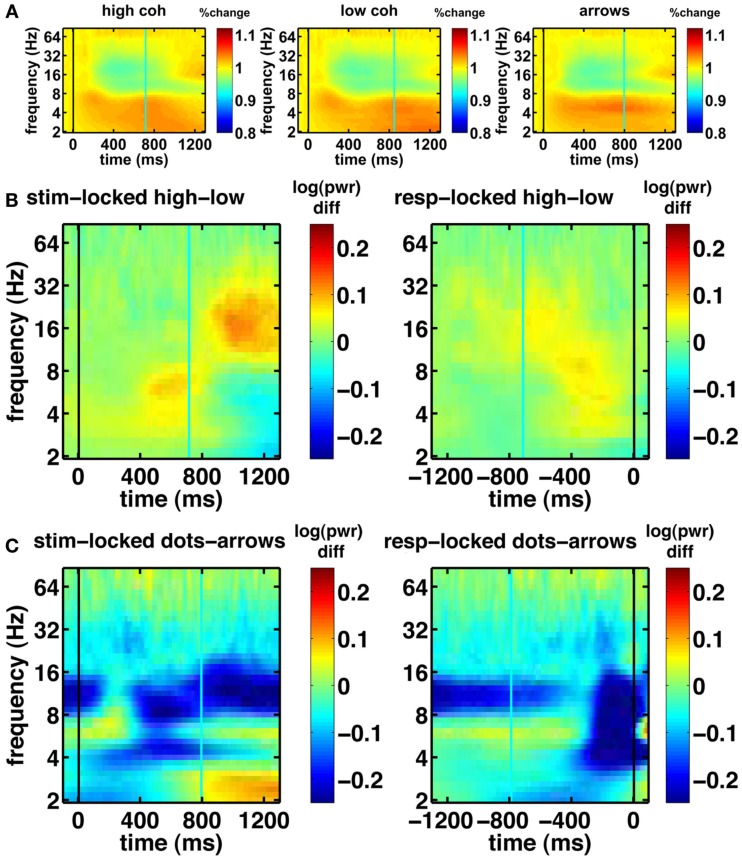
Figure 6.
Basic spectrograms for electrode Cz (a representative electrode). Black line indicates the event to which the data are aligned (onset of dot-motion for the stimulus-locked graphs and the response for the response-locked graphs). Cyan line indicates the average response time and stimulus onset time, respectively. (A) stimulus-locked spectrograms for the high-coherence, low-coherence, and non-integration condition. There is a gradual decrease in oscillatory power over the course of the trial. (B) Difference spectrograms comparing low- and high-coherence conditions. Left column: stimulus-locked. Right column: response-locked. (C) Difference spectrograms indicating the contrast between integration and non-integration conditions. Left column: stimulus-locked. Right column: response-locked.

