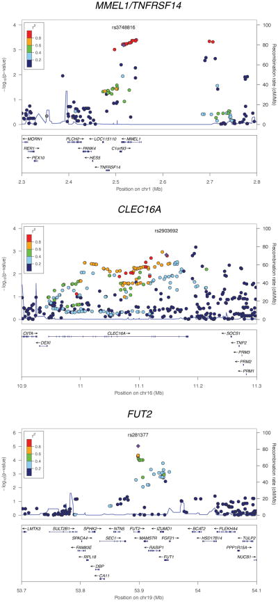
Figure 1. Regional association plots for MMEL1/TNFRSF14, CLEC16A and FUT2.
The association results for both the genotyped and imputed SNPs are represented by the −log10 P-value plotted against the genomic position. The index SNP is marked out with a purple diamond while the colors of the remaining SNPs indicate the linkage disequilibrium with the index SNP. The recombination rates were derived from the HapMap project and are represented by the thin blue lines. The plots were generated using the LocusZoom software [10].

