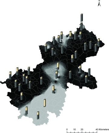
Figure 3.

White phenotype distribution (grid map) and mean q1 values for Exotic cluster (bars). The background color represents the probability of observing white phenotypes. The lighter it is, the higher is the proportion of white phenotypes. Bars represent the average q1 value per commune of belonging to the Exotic cluster.
