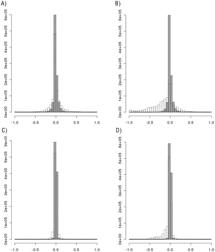
Figure 2. Histograms of the change in LD for each pair of SNPs in Gene Region 1.
Histograms of the change in simulated LD from original LD for each pair of SNPs in Gene Region 1 (LDsimulated – LDHapMap). A) D’, Resampling (gray) vs Hapgen (dotted); B) D’, Resampling (gray) vs HapSim (dotted); C) r2, Resampling (gray) vs Hapgen (dotted); D) r2, Resampling (gray) vs HapSim (dotted).

