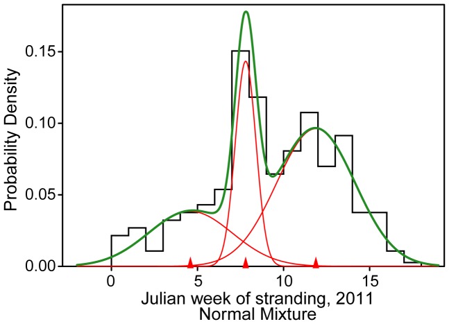
Figure 4. Mixed distribution analysis of 2011 dolphin strandings.
The statistically best-fit distribution of total weekly bottlenose dolphin strandings during January – April 2011 [12]. Red lines show the individual components of the best-fit mixture distribution (green), and red triangles indicate the mean of each component distribution. Overlapping distributions were fit iteratively using maximum likelihood of variable combinations (mean, variance, and proportion of each distribution) in the ‘mixdist’ package 0.5–3 in R 2.13.0.

