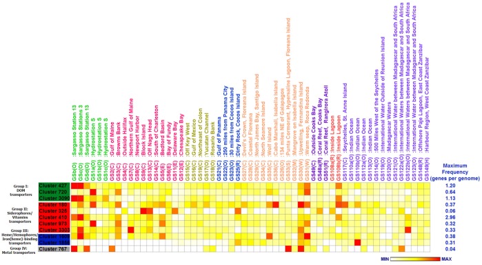
Figure 2. Heat map comparison of frequencies each cluster in different GOS samples.
The frequency value each GOS site was assigned a color relative to the maximum value seen in each cluster. The maximum value of frequency is shown at the end of its corresponding row. The colors represent 0 (white) to MAX (red). The different GOS sampling areas are highlighted using colored text.

