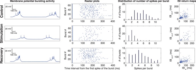
Figure 4. Results of the activity-dependent drug stimulation protocol.
The rows on the first column show the membrane potential time series during control (top row), stimulation (middle row) and recovery after washout (bottom row). The rows on the second column show the raster plots for control (top), stimulation (middle) and recovery (bottom). The rows on the third column show the distribution of the number of spikes in each burst for the three time series. Finally, the panels on the fourth column show the inter-spike intervals (ISI) return maps during control (top), stimulation (middle) and recovery (bottom). Note that during the stimulation, the number of spikes per burst drastically decreased because of the RT activity-dependent GABA microinjections.

