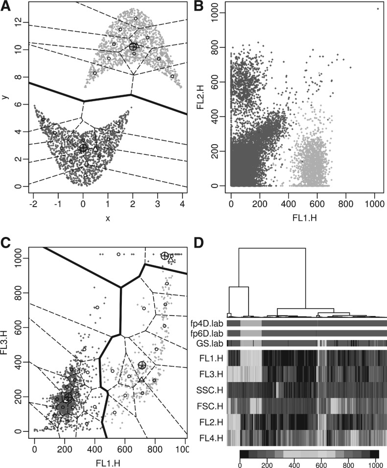
Fig. 5.
The application of flowPeaks to different datasets. See Figure 4A for explanations of legends. (A) Concave data. (B) One sample of the GvHD dataset that is shown in Figure 3C. The boundaries between flowPeaks clusters and between K-means clusters are not drawn as two non-overlapping clusters generated in 4D may overlap in a 2D projection. (C) Rituximab dataset. (D) The same sample in (B) with FSC and SSC channels included. Due to the long running time required for the heatmap, 4000 data points were randomly selected to generate the cluster-tree and the heatmap. The three rows fp4D.lab, fp6D.lab and GS.lab, respectively, display the class labels of the flowPeaks on 4D, flowPeaks on 6D, and the Gold Standard, where different colors indicate different clusters. The signal intensities of all six channels are displayed in the heatmap with the key displayed on the bottom (A color version of this figure is available as Supplementary Material)

