. 2012 Mar 22;9:E75.

Figure.

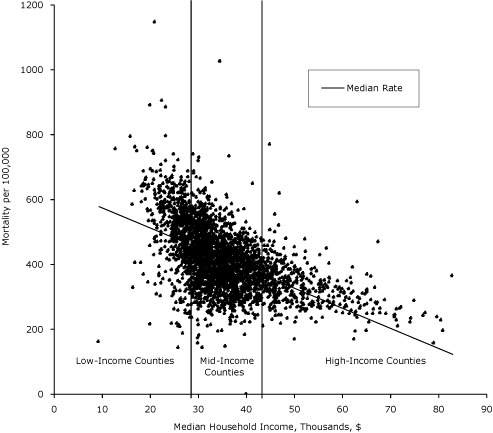
plotted graph A scatter plot depicts the association between premature mortality and median household income for the counties. Data fall on the x-axis from $9,333 to $82,929; data fall on the y-axis from 144 to 1,146 deaths per 100,000. Two vertical bars on the graph represent 25th ($29,361) and 75th ($39,401) percentile delineations of median household income. Most of the counties (1,570) fall between the 2 bars. The age-adjusted mortality rate for those counties ranges from approximately 200 to 600 deaths per 100,000 population aged birth to 75 years.

Median annual household income and age-adjusted mortality per 100,000 population aged birth to 75 years, 2002-2006. Bars represent 25th ($29,631) and 75th ($39,401) percentile delineations of median household income for 3,139 US counties. Counties are grouped by median household income levels into low-income (n = 785); mid-income (n = 1,570), and high-income (n = 785) counties.