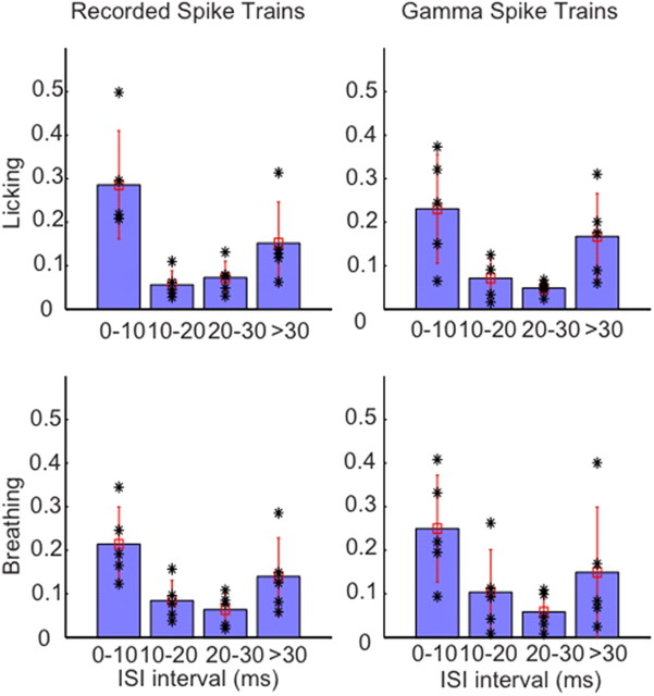
Figure 6.
Distribution of Granger causality peak values at different ISIs. Five recordings for each behavioral condition with a mean rate close to the overall mean rate were chosen for analysis. This selection ensured that all cases had a representative sample of the different ISI groups chosen. The causality peak distribution plots for recordings and the matched surrogate data are shown side by side. Each black asterisk corresponds to peak Granger causality value of ∼6–7 Hz for datasets associated with licking behavior and ∼3–4 Hz for datasets associated with breathing. The blue bar denotes the mean, and the vertical red line, the SD. The asterisks represent individual data points. The figure clearly shows that the causality prediction is high for short but not for intermediate ISIs, and again increases for long ISIs > 30 ms.

