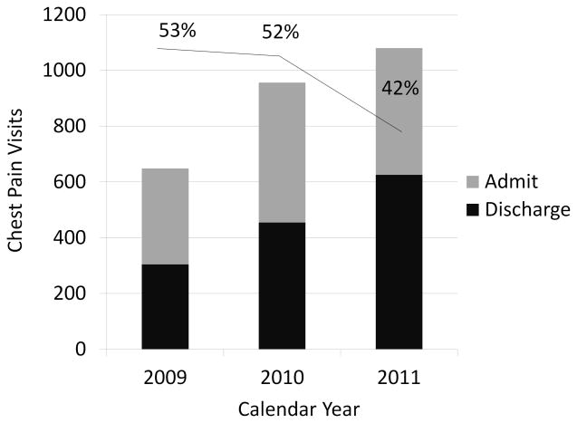
Figure 3.
Each bar represents volume of patients with a primary symptom of chest pain for the same six week time frame from 2009, 2010, and 2011. The dark bars represent the proportion of patients who were discharged and the gray bars are the proportion admitted from the ER. The line at the top of the graph shows the percentage of patients admitted and the drop from 2010 to 2011.

