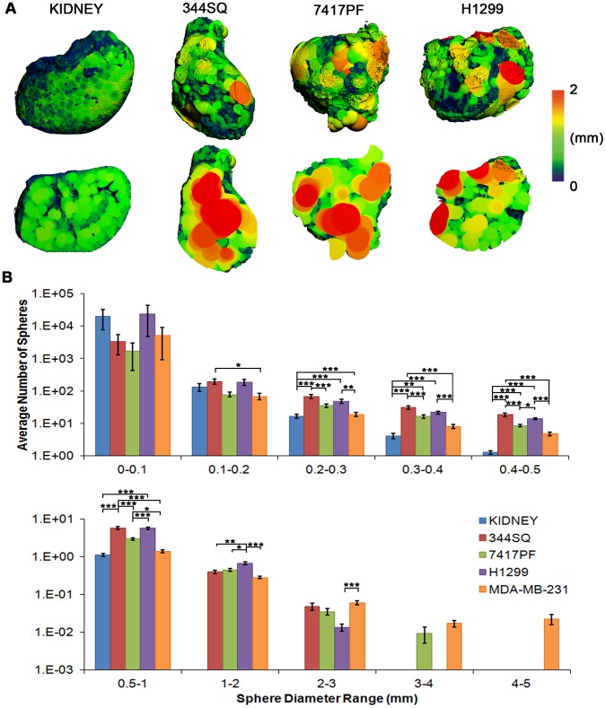
Figure 4. Imaging and quantification of avascular necrosis.
(A) 3-D renderings from the kidney and NSCLC tumors following application of the maximal sphere-filling model; intact sample views above and cross-sectional images below (red indicating 2 mm or greater diameter of sphere). The presence of red (avascular) areas can be seen in all the tumor cell lines tested. (B) Histogram quantification of the maximal-spheres of two human and two murine cell lines by evaluating the total number of spheres present at increasing ranges of diameters (from 10 µm to 5 mm) (note the log scale on Y axis). Considerable variability is evident within both the vascularised and avascular areas within the tumors, with significantly more avascular areas being present in tumors, in contrast to the well-vascularized kidneys. Data indicate averages ± s.e.m. (N = 3–6 tumors per cell line). Asterisks indicate: * p<0.05, ** p<0.01, *** p<0.001.

