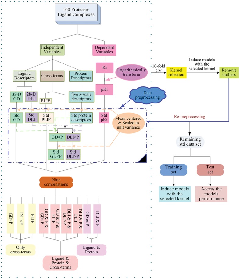
Figure 1. Graphical illustrations of the goodness-of-fit and predictive ability of the obtained models with the selected kernel.
Goodness-of-fit is shown as red solid circles, and predictive ability is shown as blue solid circles. The predicted versus measured activity values using different combinations of descriptor blocks, i.e. GD×P (a), DLI×P (b), PLIF (c), GD & P & GD×P (d), GD & P & PLIF (e), GD & P (f), DLI & P & DLI×P (g), DLI & P & PLIF (h), DLI & P (i) are shown in the figure.

