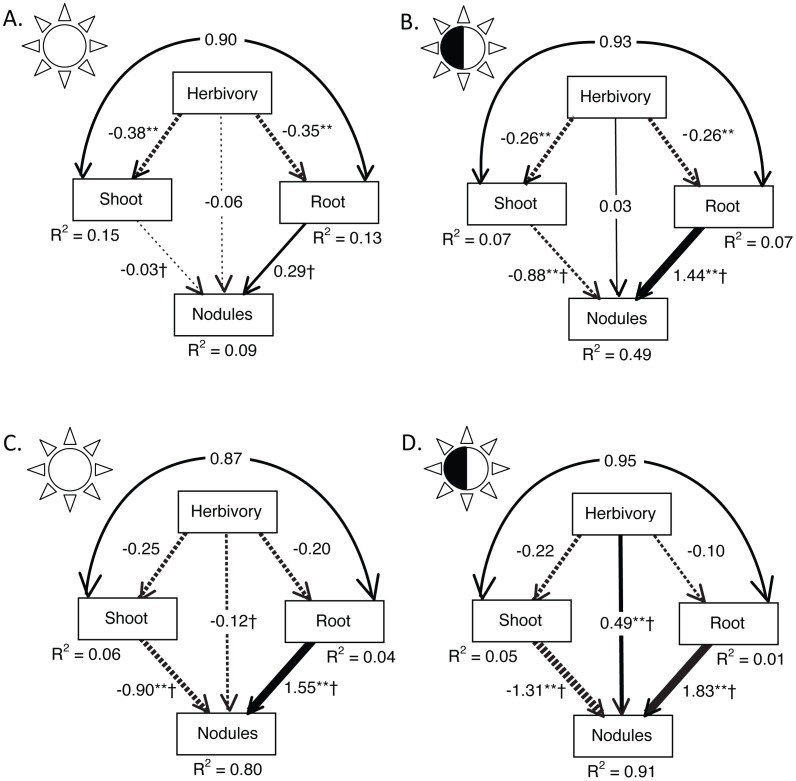
Figure 1. Path diagrams showing the standardized regression weights and the amount of variation in each variable explained by the input arrows (R2).
Straight arrows reflect causal paths, with the strength of the relationship designated by arrow thickness. Curved arrows designate correlations. Asterisks denote statistically significant paths: *p<0.02, **p<0.001. Paths that are significantly different between sun and shade treatments are indicated with †. Results of the ‘phenotypic’ SEM on all individuals are shown in panels A (sun, N = 682) and B (shade, N = 681); those of the ‘population’ SEM on population means are shown in panels C (sun, N = 8) and D (shade, N = 8).

