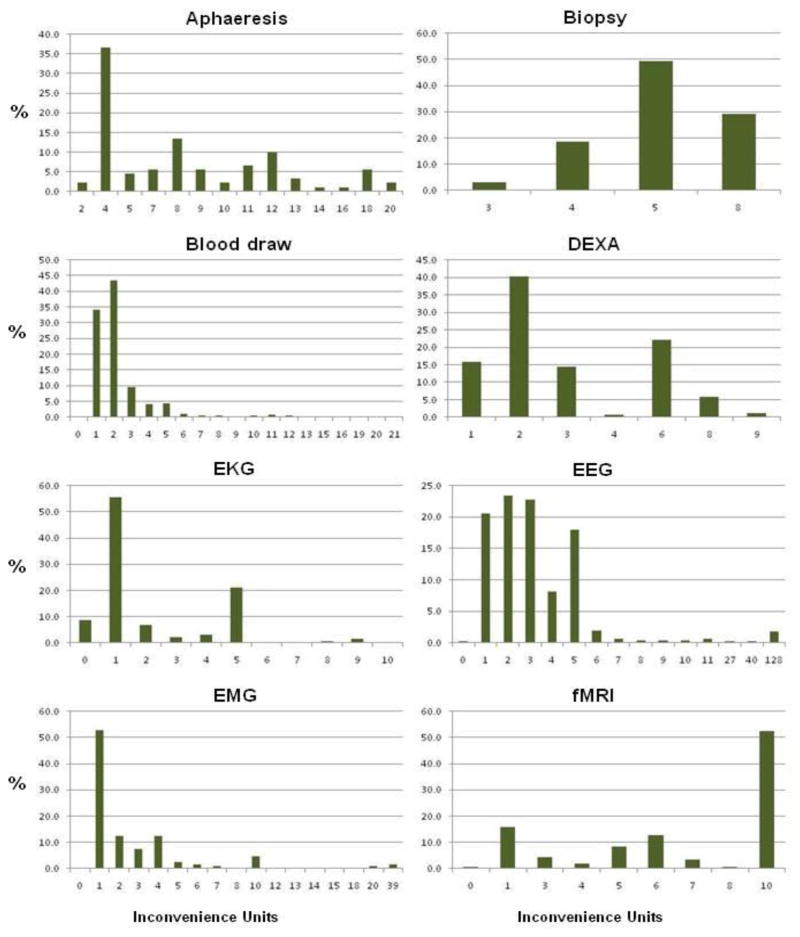
FIGURE 2.
Histograms of the distributions of the inconveniences units (and their percentages) on payments made to research participants in the intramural program of the NIH Clinical Center from August 2004 to August 2008. These supplement detailed data in Table 1 and provide a visual description of the range and occurrence of inconvenience units assigned for each procedure that can also be compared to each other at a glance. Data collected by the NIH CRVP.
The range of inconvenience units for each procedure is unique to its distribution. Due to a wide range of units for some, the units presented on the x-axis are not equidistant and may jump numbers. In addition, depending on the distribution, some low frequencies may not be visible in the figure.


