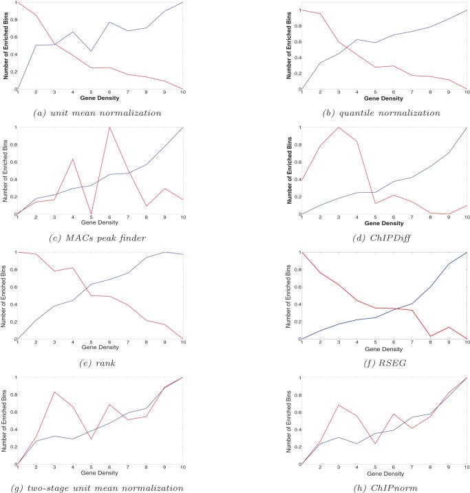
Figure 6. Enriched bins with respect to gene density in 1 Mbp region.
The plots are normalized.  axis 1 to 10 indicates lowest to highest gene density, while
  axis 0 to 1 indicates minimum to maximum average number of differentially enriched bins for both ES and NP cells. Blue line indicates ES differentially enriched bins and red line indicates NP differentially enriched bins. The number of enriched bins per 1 Mbp should increase with gene density.

