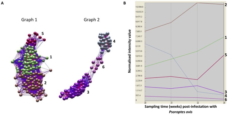
Figure 2. Network graph analysis and clustering of differentially expressed genes based on temporal expression profiles.
A) Network graphs generated in BioLayout Express 3D utilising log-normalised expression data from 621 genes significantly differentially expressed in circulating leukocytes during time course of infestation with P. ovis. Graph 1 shows genes up-regulated with time and clustered into three distinct groups (Clusters 1, 2 and 5). Graph 2 shows genes down-regulated with time and clustered into three distinct groups (Clusters 3, 4 and 6). Each sphere (node) represents an individual gene and each line (edge) represents a relationship between nodes, i.e. correlated gene expression profile over time. B) Class mean expression profile plot showing mean expression profiles (based on the normalised mean intensity values for each gene within an individual cluster) for all genes in each of the six clusters.

