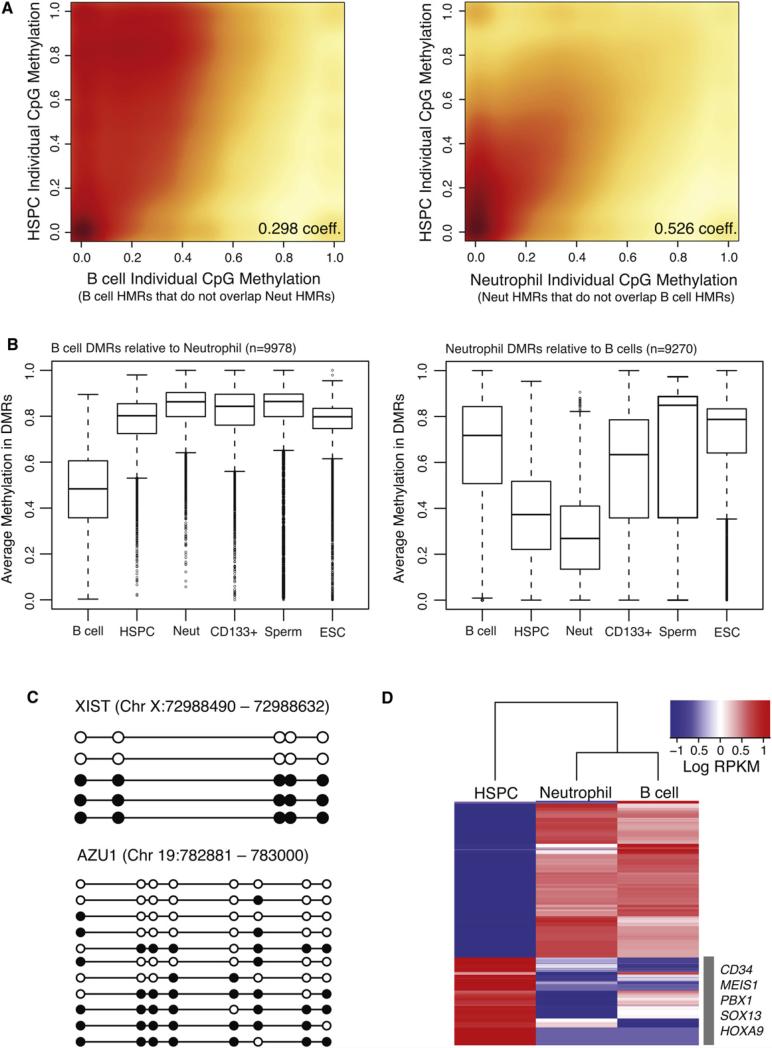
Figure 5. Methylation Dynamics during Lineage Selection.
(A) Smoothed scatter plot heat maps showing the correlation between individual CpG methylation levels in HSPCs versus B cells (left) and HSPCs versus neutrophils (right) within B cell- and neutrophil-specific HMRs, respectively. Darker shading (red) indicates greater density of data points, while lighter (yellow) shading reflects lower density. Positive correlations between HSPCs and both B cells and neutrophils indicate an intermediate state for HSPCs.
(B) Box plots show the distribution of average methylation levels in regions of differential methylation (DMRs) between B cells and neutrophils. Whiskers represent minimum and maximum values, while boxes depict the interquartile range, with horizontal lines indicating the median value. Outliers are shown as open circles.
(C) Lollipop diagrams display the methylation status of HSPC-derived clones sequenced by conventional methods following bisulfite conversion and site-specific PCR amplification across an interval near the XIST gene (top) and the AZU1 gene (bottom). Filled and open circles represent methylated and unmethylated CpG sites, respectively.
(D) Heat map of log RPKM values show expression levels for the top 100 differentially expressed genes (rows), selected for high expression in one cell type compared to the other, in each cell population (columns). Signature marker genes found within the HSPC cluster are listed.
See also Figures S3, S5, and S6 and Table S3.

