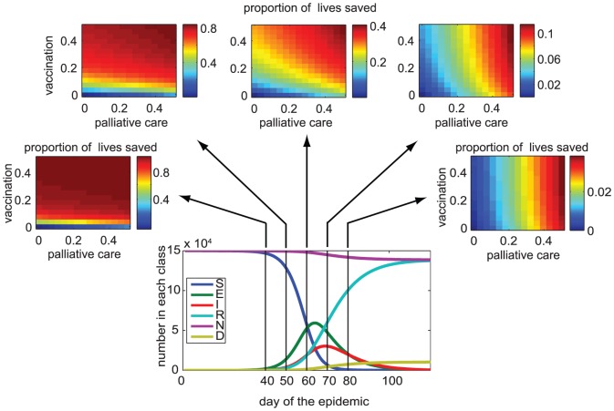
Figure 2. Proportion of lives saved compared to the baseline case over the range of intensities of vaccination (y-axis) and palliative care (x-axis) in simulated epidemics for different times of onset of control implementation.
Red colors represent higher effectiveness. Bottom graph shows the epidemic curves for the uncontrolled case; the vertical lines show the days of the outbreak for which we implement control (vaccination and palliative care) in relation to the peak of the epidemic. The model is parameterized according to the 2003–2004 measles outbreak among children in Niamey. Parameter values:  ,
,  days,
days,  days,
days,  year−1,
  ,
,  .
.

