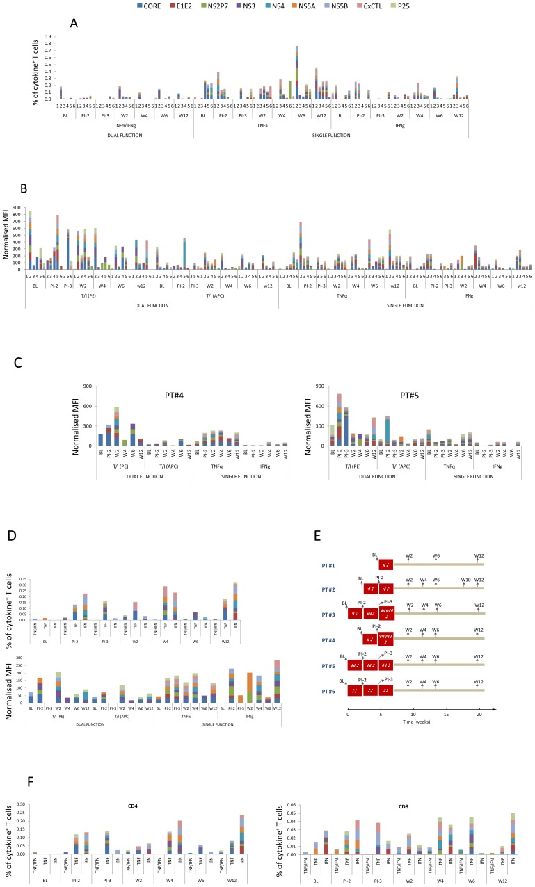
Figure 2. Cytokine positive responses - a complete dataset from all patients.
(A) Cytokine producer frequency (%, gating on viable CD3+ T cells) at baseline and different time points thereafter. The numbers on the x-axis (1, 2, 3, 4, 5 and 6) are the patient ID. Abbreviations: BL = Base Line; PI-2 = Prior to 2nd Infusion; PI-3 = Prior to 3rd Infusion, W = Week post final infusion. (B) The normalised MFI, corresponding to the responses detected in (A). (C) T cell quality in PT#4 and PT#5, depicted by the normalised MFI of cytokine positive responses. (D) The frequency (%) and normalised MFI over time in PT#3. (E) The dose and timing of DC infusion each patient received and the timing of sample collection. (F) Contribution of CD4 and CD8 T cells (please note the differences in scale) to the cytokine positive responses in PT#3.

