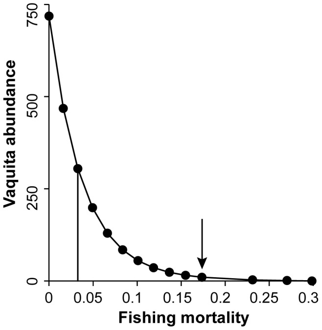
Figure 3. Vaquita abundance equilibrium curve.

Vaquita abundance as a function of absolute bycatch mortality. Each bycatch mortality point in the figure is the ratio of average catch and biomass for the last 5 years (2033–2038) of a simulation run under a specific bycatch mortality value. Solid vertical line indicates maximum sustainable bycatch mortality. Arrow indicates bycatch mortality for the No management scenario.
