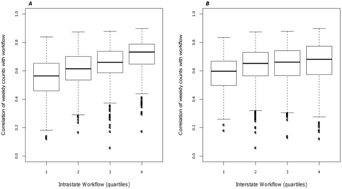
Figure 4. Correlation of weekly time series with human movement.
A) Synchrony as a function of workflows. B) Synchrony as a function of Pennsylvania and neighboring county workflows. The distribution of workflow was categorized by quartile. The boxplot within each quartile represent the distribution of the correlation of workflow between pairs of counties.

