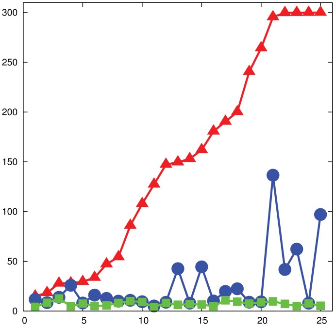
Figure 6. Experimental performance, 24-node networks.
Performance of the experimental subjects on networks of  nodes. The plot shows the time to reach a perfect matching of size
  (red), an approximate matching of size
  (a
(a  –approximate matching, in blue) and a matching of size
  (a
(a  –approximate matching, in green). Results for single games are reported. The
  -axis shows the indexes of the games sorted by increasing solving time, while the
  -axis shows the time in seconds. The right-most four games on the red plot did not converge to a maximum matching and correspond to three instances of the “bad” graph
  and to one instance of the preferential attachment network.

