
Figure 9. Relationship between  and the proportion of genetic variation explained by the first two components of the PCA.

Both the main analyses of the paper in Table 2 and the supplementary analyses of Sub-Saharan Africa, in which certain populations excluded from the main analysis are included, are considered in obtaining the regression line. The values on the x-axis were obtained by summing the proportions of variance explained by PC1 and PC2 (columns 2 and 3 in Table 2, columns 6 and 7 in Table S7).  values were estimated from the same datasets as used in the PCA (column 7 in Table 2, column 11 in Table S7). The dashed line indicates the linear least squares fit of
 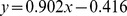 . The Pearson correlation is
  .
.