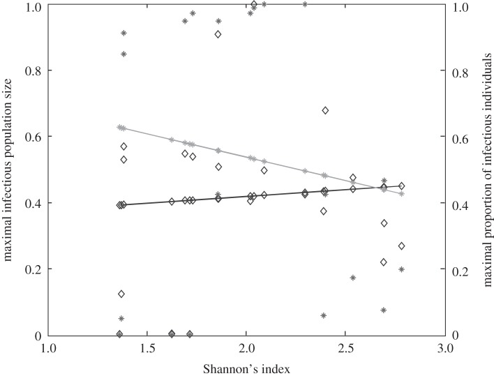
Figure 2.
Relationship between host species community characteristics (X-axis: Shannon's index, see the main text for mathematical formulation) and peak disease prevalence, in terms of abundance (left Y-axis; dark grey line and diamonds) and proportion (right Y-axis; light grey line and crosses) of infectious individuals. Both axes are rescaled between 0 and 1 for readability. Dark and light grey lines represent linear regressions and diamonds and crosses on these lines are the values predicted by linear regressions. Parameters used: a = 0.6931, b = 0,  days,
days,  ,
,  ,
,  ,
,  . z and Y0 are modified to explore different shapes of host community structures.

