
Figure 3.
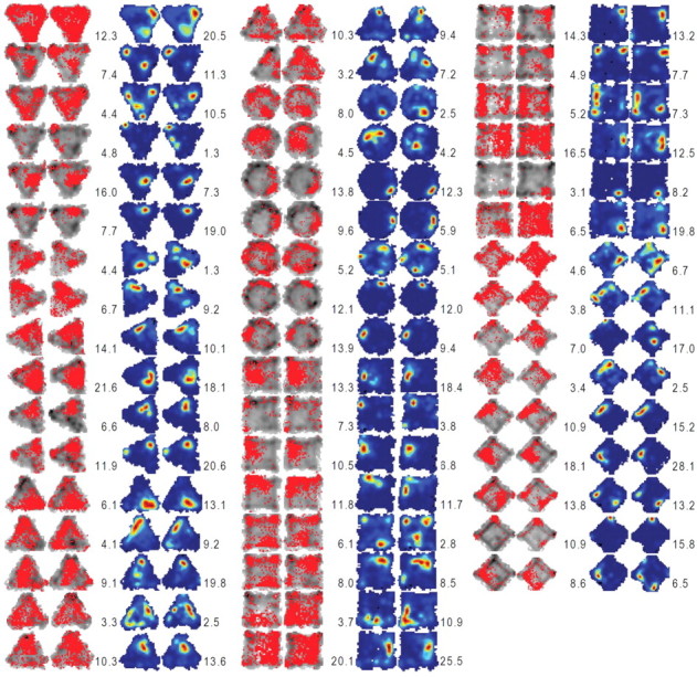
Occupancy (or visit) maps and place maps of all place cells analyzed from CORT-treated animals. The left two columns in each group (gray contours and red dots) represent the occupancy maps before and after the CORT injection. The right two columns in each group show place maps corresponding to the occupancy maps. The color scale for the firing rate in each place map corresponds to the firing rate (red, highest; blue, no spike) for each unit. The peak firing rate for each session is specified on the left (session 1) and right (session 2) sides of the corresponding place map.