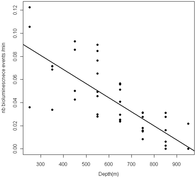
Figure 5. Bioluminescence into the water mass.
The graph represents the distribution of the bioluminescence events according to the depth. The number of events was corrected by the time spent by all the individuals in each depth category. The black line shows the linear regression between the number of bioluminescence events per minute and depth.

