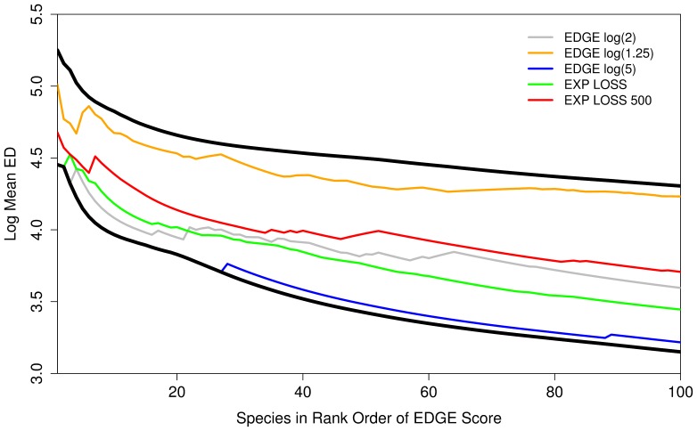
Figure 2. The mean ED scores of the top 100 species chosen using five different methods to create EDGE lists.
Thick black lines indicate upper and low limits where species are chosen purely by having the highest ED score irrespective of threat (upper line) and just the most threatened (lower line) species are chosen. Lines represents the mean ED of the top 1:n top ranked species by each EDGE listing process. Note logarithmic y-axis.

