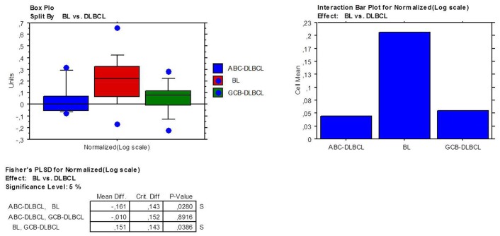
Figure 2. ADPF gene over-expression in BL compared to DLBCL.
Box plots represent the values distribution across the three considered categories (A); the extremities of the boxes indicate the first and third quartile. The horizontal lines inside the boxes indicate median values; outlier values are indicated by blue dots. Histograms represent the mean expression values in the three groups (B).

