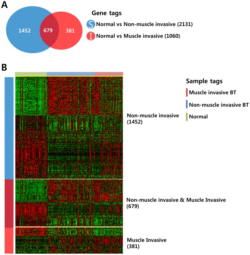
Figure 2. Comparative analysis of differentially expressed genes among the patient groups.
(A) Venn diagram of genes selected by a 2-sample t-test. The blue circle (gene list S) represents genes differentially expressed between normal mucosa and NMIBCs. The red circle (gene list I) represents genes differentially expressed between normal mucosa and MIBCs. A cut-off P-value of less than 0.001 was applied to select genes with an expression that was significantly different between the two groups. (B) Expression patterns of selected genes in the Venn diagram. The data are presented in matrix format in which rows represent individual genes and columns represent each tissue. The red and green colors reflect high and low expression levels, respectively.

