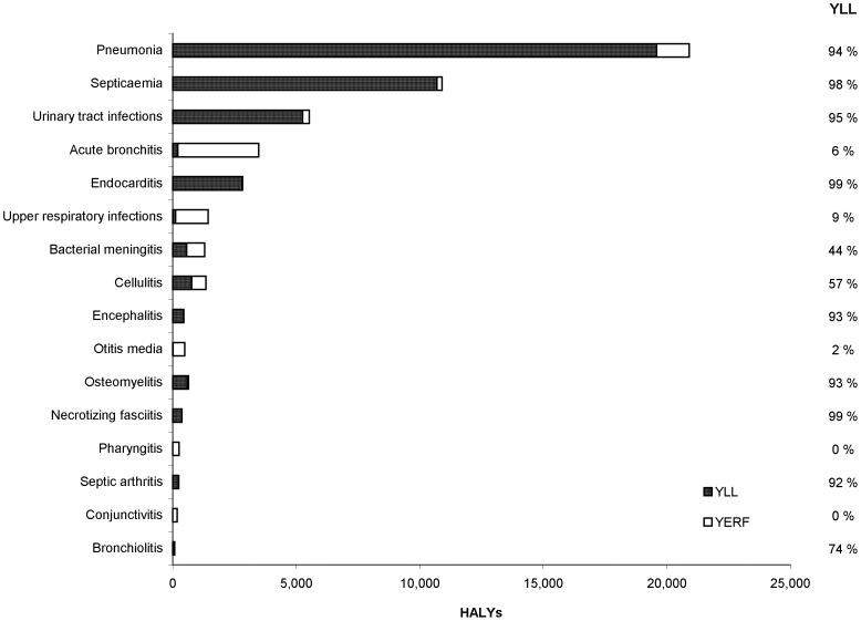
Figure 2. YLL, YERF and HALYs by infectious syndrome, 2005–07, Ontario, Canada.
For each infectious disease syndrome, the dark-shaded portion of each bar represents YLL (years of life lost to premature mortality) and the light-shaded portion of each bar represents YERF (years equivalents of healthy life lost due to reduced functioning). The column to the right of the chart displays the percentage of HALYs that are due to YLL for each syndrome.

