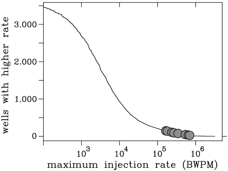
Fig. 4.
Cumulative distribution of highest monthly injection rates for wells in the region mapped in Fig. 5. The horizontal axis is the highest monthly injection rate between October 2006 and September 2011; the vertical axis is the number of wells exceeding plotted value. Dark circles correspond to maximum values for wells closest to the eight earthquake groups with A-quality epicenters identified in Fig. 2 and Table 1. Note that all eight have maximum injection rates exceeding 150,000 BWPM (24,000 m3/mo), a value exceeded by 160 wells in the mapped region (Figs. 1 and 5).

