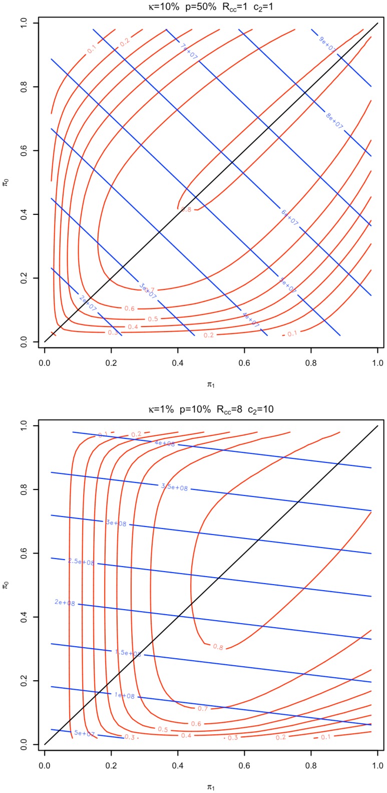
Figure 4. Power and cost surfaces.
Power curves (red) and cost lines (blue) for the experimental conditions  and
and  (where
  is the disease prevalence,
  the population disease allele frequency,
  the stage 2 genotyping cost, and
  the ratio of controls to cases) are plotted as a function of the proportion of controls (
 ) and cases (
 ) genotyped in stage 1, holding the proportion of markers followed up in stage 2 (
 ) at their cost minimizing values of 8.5% and 0.7% respectively. In the first case (top), power curves and cost lines are symmetric about the identify line, implying that the cost minimizing design will use equal case and control allocations. In the second (bottom) they are asymmetric, implying that the cost minimizing design will have unequal case and control allocations.

